 This will be a first. In the evolution of our site, we’ve never had a guest author write an article, but hey, there is a first time for everything. While the concept of guest authors is not new to blogs, it is new for us, so if it is well received, I will try my best to get more done.
I want to first introduce our author and hopefully provide a bit more context. For members of our private trading community, “MR” as he goes by should be no stranger. Heck, you don’t even need to be a member to have potentially heard of him. If you’re a listener of the free Stock Trading Reality Podcast, hopefully you’ve already listened to his podcast episode (which was crazy good!). Maybe the name sounds familiar because you remember reading about how he made $51,000 is a single day, as he documented here.
 The point I’m trying to convey is MR is not some random person who just popped up out of nowhere. He has a great history with our community and as anyone can attest to who has interacted with him, he’s one of the nicest and humblest guys ever.
With that being said, just move along to another site if you are going to play the “I want to see proof of these gains” that he talks about in the article. He already proved them here, so I fully trust him… if you don’t, well then like I said, best of luck to you on your journey. I’m not going to make him show account statements like he has already done.
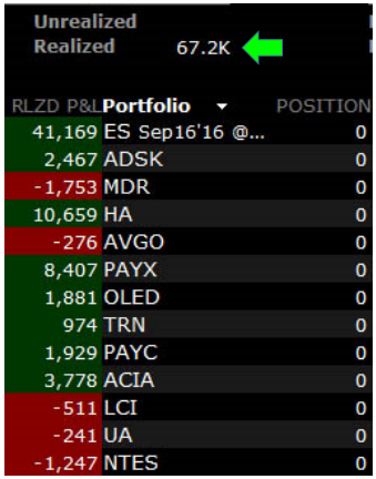
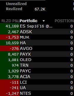
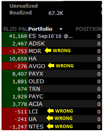
Here are the results he had for the week of 7/4 through 7/8. A week profit of $67,200. Not too shabby huh?
MR is going to break down, in detail, the trade that gave him $41,000 in profits, but I want you to keep in mind two main concepts as you read through his thoughts.
- As much as some people may try and convince you that trading is pure glamour and fanciness, trading takes time and “thought”. Random throws of the dart are not going to keep you in this business long. You may be a bit overwhelmed by his trade plan, that’s fine. I’m not saying plans have to go “this deep”; however, if you think that trading is a “I wake up one morning and then money starts to rain from the sky type situation”, you are sorely mistaken.
- Here at ClayTrader.com, we’re all about technical analysis (the use of “charts”). When developing certain trade plans (as you’re about to see), there is nothing wrong with fundamental analysis either. MR does a beautiful job of blending the two, and it works out very nicely. It also goes to show that there are MANY ways to pull profits from the market. Some people strictly use charts, others blend charts together with fundamental analysis.
Let’s get to MR… enjoy yourself!
US Markets: The Least Stinky Socks in the Hamper Trade Theory.
My trades for the week were based mainly on the concept behind the title of this body of information I present to you. The concept is deeper than just what I can present here as each piece of information is supported by an ever branching spider web of variables, concepts, and complex sets of data that all culminate in my opinion of the broader markets and global conditions we are trading in. This is all my own opinion. It is no better or worse than any other opinions and may be completely wrong. However, as it was the stars aligned and it worked in my favor.
My opinion is based upon the premise that the macro (global) environment is such that money around the world is being forced to the US markets. As we all know, there is much turmoil financially outside of the US. At the moment there is a global flight to safety and a desperate need for yield. While the US economy is not turning any heads with its amazing growth, it is holding steady at a low rate. The macro situation has created a situation where the Fed is basically handcuffed, as well as nowhere abroad for money to find returns. I could go on for many pages with the macro environment and variables that bring me to my train of thought, but since we are a charting community I will try to speak our language. While the information I will present below is only a small piece of a constantly changing puzzle in my mind, it should illustrate how a fundamental investor can look deeper into the market using charts.
Hopefully after reviewing this you will see how I have come to my theory that while investors are not excited to be buying the S&P here, they really are at a loss for alternatives. Hence the silly title of my thesis. They don’t want to wear the stinky socks but they don’t have any clean laundry in their drawers and are forced to go looking through the laundry basket for the least stinky socks in there.
I did not create the images, I borrowed them from another source to save time.
How a fundamental investor can get value from charting.
A look at the global environment from the perspective of stocks.
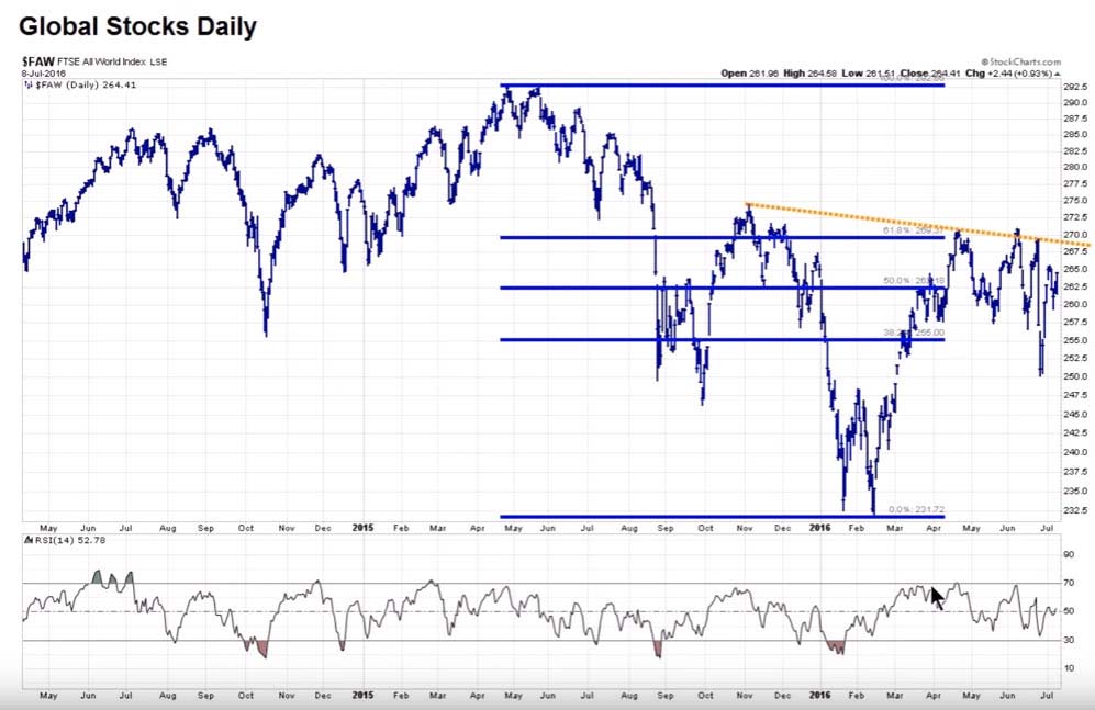
Not really a strong environment or appetite for risk assets.
To add more color, we will look at how stocks are doing against bonds globally.
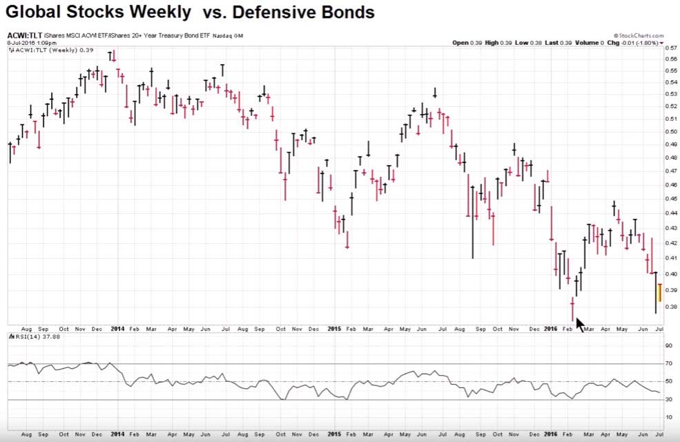
Bonds are far outperforming stocks above. This tells me a story. This says that people are reaching for yield and safety globally. They are not looking to the equity markets abroad for this yield. Many bonds abroad have a negative yield. In fact, 11.6 trillion dollars are invested in negative yielding bonds.
In some cases, this money needs a fixed rate of return, for instance, to keep a pension fund from going insolvent, or municipality from going bankrupt, etc. So where would this money that desperately needs a return go?
SPX 500 –
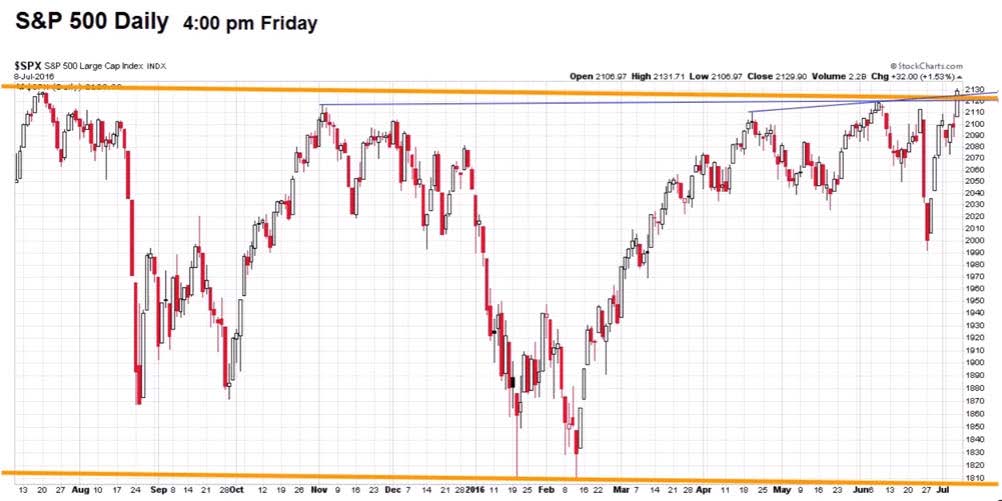
Now this is a pretty chart, BUT it does not tell the whole story. It tells where price is at and price pays, however, there is more going on behind the scenes that presents an argument that some caution is warranted. This chart is weighted, meaning that the larger market cap stocks in this index will carry more weight in the direction of its movement. So out of the 500 stocks in the index, the top 20 or so are really doing a lot of the work. The largest corporations in America are viewed as being a far safer bet than the smaller ones, so this hints further to the safety trade. We could branch off into market breadth, volume, etc but for the sake of keeping this at a reasonable length we will just move on to the next chart.
To take a larger view of the market, we have the NYSE composite. This composite uses a free float market capitalization which does not heavily favor larger cap stocks over smaller cap stocks. It also includes over 2000 stocks, so it is a much broader measure of what the stock market in the US is doing.
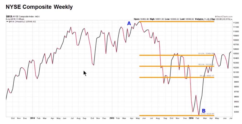
As you can see, this index reflects money flowing into it, but does not compare to the amount of interest reflected in the SPX (the safety trade of the US large cap stocks).
I added this slide of the NYSE for the CTU members who prefer candles (as I do).
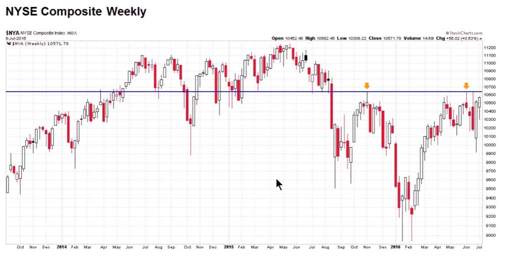
Those of us who read charts can see a NYSE resistance point ahead. The Nasdaq, Dow, and Russell 2000 are lagging the SPX in terms of marching toward their all‐time highs. The SPX is the strongest and will most likely be facing its ATH resistance first. In fact, we are just a few basis points from that all‐time high. The SPX may break through and forge a new high soon, but will most likely stall or have some trouble when the other averages reach their respective resistances points if this uptrend continues. We could, again, go many pages into the different indices and technical aspects, but that’s not really within the scope of this writing.
Equal weight SPX vs bonds.
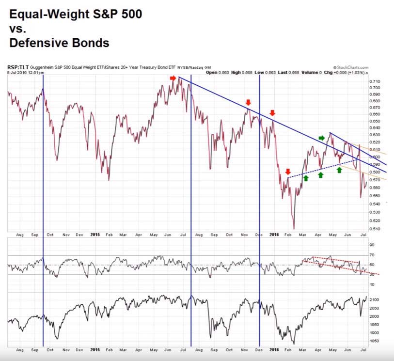
Looking at this chart, you can see how even though the SPX is pushing toward a new all‐time high people would still rather be in the safety of US bonds that have historically low yields at the moment.
Since we looked at the SPX vs. bonds, we may as well do the same comparison of NYSE to bonds.
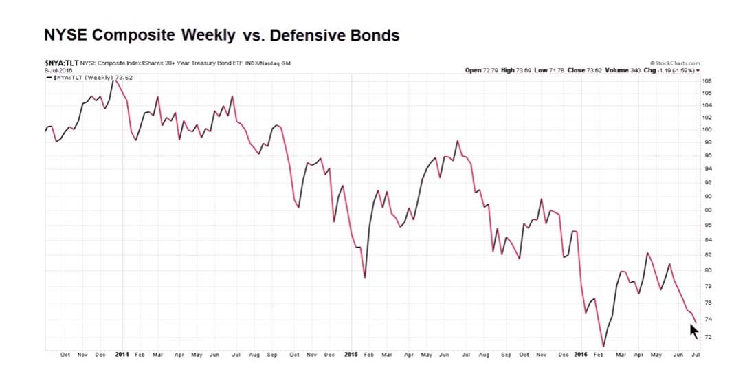
Same picture, only it looks even more bearish. The top 500 stocks in the SPX are drawing in more money than the broader market, however they are still paling in comparison to bonds.
Conclusion:
All this money is on the sidelines, and/or fleeing from the markets abroad. The run in bonds, gold, and the types of sectors (defensive) that have led us to a stone’s throw from new all‐time highs is one of the bedrock principles in my theory. People NEED yield/returns or they go bust in some cases. There is so much money looking for a place to go, and even though seemingly the lions share of that money is hitting the bond market, the bonds yield is not enough to make the return needed/desired. Inevitably a portion of that money is flooding into the US equities market where the yield/return can help offset the low yields in bonds (albeit at a higher rate of risk). As I have stated, in my opening comments:
“While the US economy is not turning any heads with its amazing growth, it is holding steady at a low rate. The macro situation has created a situation where the Fed is basically handcuffed, as well as nowhere abroad for money to find returns.”
As long as there is no data released to put a chink in the US story for now. I think this money continues to be pushed into our markets.
This is what I based my trades on for the week. I saw the shallow pullback after the massive retracement from the “Brexit” sell‐off. I saw the way the VIX responded during the lows of the sell‐off, coupled with the above narrative, market profile, and other factors. I started accumulating my positions. I did not really even look at the charts as I was accumulating. I knew everything was pretty much in an oversold condition and that the Brexit results would handcuff the Fed which I assumed would ultimately push money into our markets once the bottom was in. From what I observed, I had thought the bottom was close if not already in. During the pullback, I bought things I thought were strong companies in their respective sectors, and a few others that I just liked. Since I was buying in an oversold condition I figured these stocks had a fair chance to rally back when the market started moving in the other direction. Some worked out, some did not. The only position I truly entered with care was my ES position. As the ES is highly leveraged and my trade of choice for the last 8 months I carefully chose my entry into that position on Wednesday morning.
I truly do not like this market for investing. I am still stuck trading positions. I don’t think that the sectors that led us here can really take us to a sustained bull market with the kind of growth we have in the US and the global environment. However, it is just “good enough” now to leave not many other choices. We have also had 5 quarters in a row of declining growth in the S&P earnings cycle. We are now going to be entering a period of time where year over year earnings comparisons will be much easier. This can usher some more bullish sentiment into the markets if the forward looking guidance is accommodating. Who knows where we go from here, but I think begrudgingly we will keep chugging higher until something changes with Fed policy, fear of a US recession, or some macro event such as Brexit fallout, China concerns, or… who knows.
I am flat all positions currently. The SPX has moved 7.03% from low too high in the last 2 weeks. I am of the opinion that I will be able to buy back in lower at some point in the near future.
PnL for the week:
I leave you with a quote from an investor whose opinions I enjoy reading. I could not have said it better so I used his words. This is the same viewpoint I have and is also heavily factored into how I use my capital in the markets at this point in time.
“The market has been strong and has recovered all losses from the Brexit sell off. We are at something of a cross road here. The SPX came within a couple of points of it’s all time high of last summer. The COMPQ still has to clear its recent highs of this spring and has more to go to reach its all‐time highs of last summer. If the SPX goes into new high ground it will put into question the thesis that we are in a bear market that started last summer. If the COMPQ were to also go into new high ground it would further cloud the picture. I still believe that we are in a bear market, but it is very hard for the markets to have a major decline when world central banks are keeping interest rates at zero or even negative levels. The fact that the same central banks are printing trillions of dollars each year in funny money isn’t helping either. This bull market cycle should have ended two or three years ago but has been kept going by the actions of the central banks. No one knows how long this can continue, but it will end and when it does it will likely be ugly.” ‐J.S.
Clay here again. Just to reiterate, if you’re feeling like, “holy crap! That was intense!”, don’t worry about it. As I stated before the article, I’m not saying that a trade plan must be “that deep”. I do hope you at least recognize that dart throwing and randomness is not the bare minimum needed. You must be able to put together logical trade plans on your own.
Sometimes, you’ll be wrong, no matter how great the trade plan… I mean MR was “wrong” five times during the week, yet, looking at the loses, you’ll see he was very disciplined and kept them controlled. Truly a beautiful thing!
MR is a member of ClayTrader University, so if you’re interested in being shown how to use technical analysis for trading like what he is using, you can do so HERE.
I offer a free training event if you are not quite ready to invest into your education yet, you can sign up HERE.
Even if you choose not to spend a penny here on the site, that’s cool, I hope MR has at least opened to your eyes to the fact that making money here in the markets takes a bit more than signing up for some free newsletter site or paying for “hot stock” text alerts.